Internal Reference · v0.8
Perelel Design System.
A working reference for the Perelel rebrand—colors, type, components, and surface kits. Built so designers and developers can work from the same source of truth, and so anyone picking up a new project can ship on-brand from day one.
Quiet Authority.
Confidence without volume. Classical, architectural, and geometric in place of literal women's-health cues. Perelel is OB/GYN-founded and the design system reads with that balance: clinical when it needs to be, editorial when it feels appropriate, and warm without being saccharine.
The system favors restraint: a tight color family, three typefaces with clear roles, hairline rules, and photography that leads with humans rather than product shots. If a decision feels loud, it probably is—pull back.
What's where.
your side.
Brand & Voice
Voice
Brand house, persona, tone of voice, and how it shows up in practice.
Foundations
Color
Base neutrals, hero life-stage tones, scales, text-on-background.
Foundations
Typography
Tobias for editorial, Haffer for functional, Neue Montreal Mono for clinical.


Foundations
Iconography
Global, benefit, sachet, trust, ingredient — the icon families that ship across surfaces.
Foundations
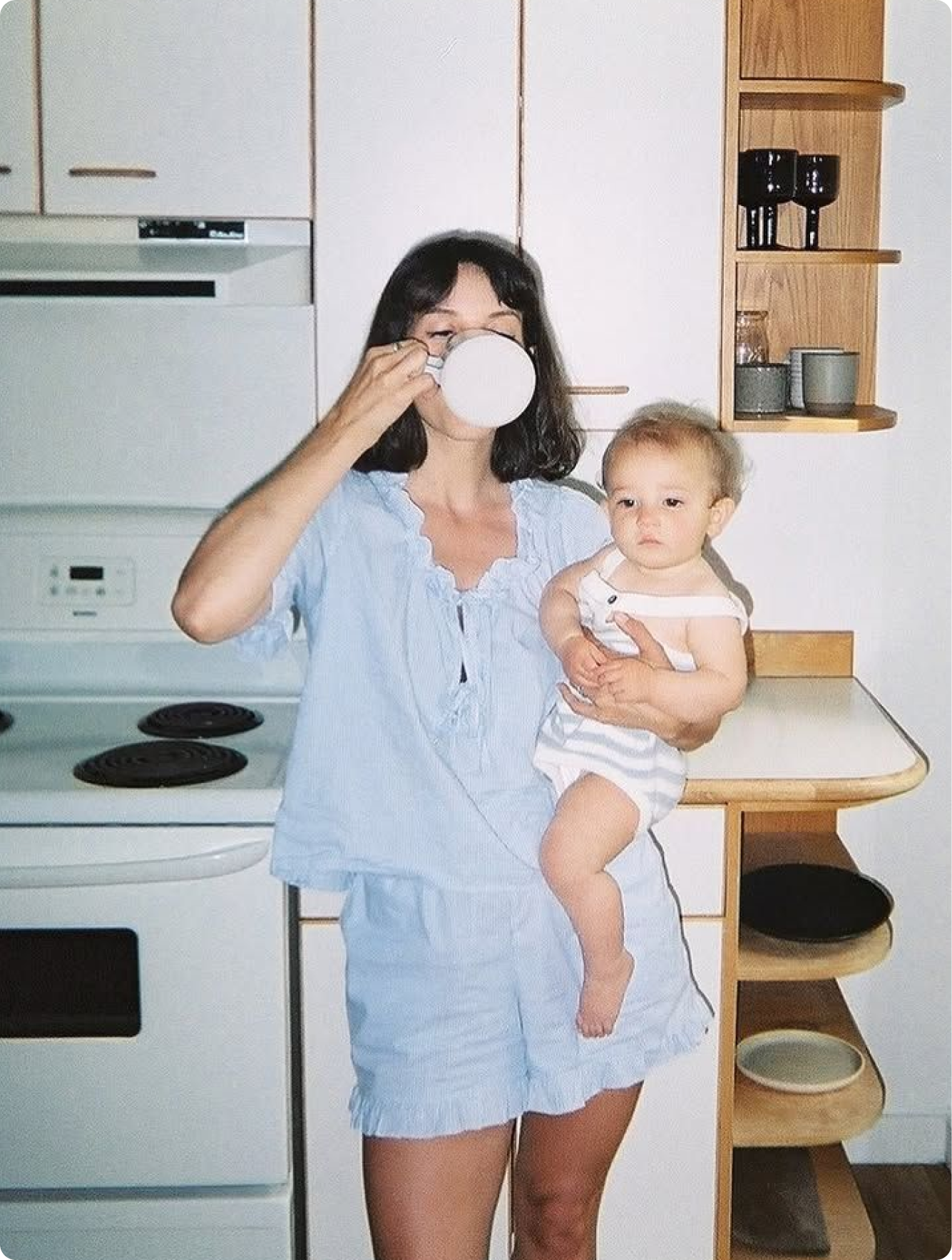
Photo Direction
In-situ, studio, clinical, UGC — the photographic registers that build the Perelel world.
Library
Components
Production-ready patterns with preview, source, and usage notes.
Library
Data Viz
Stat rings, charts, infographics & spec tables — for clinical-trial pages and PDPs.
Kits
UI Kits
Nine surface families: Web, Shop All, Product Detail, Clinical, Social, Ads, Email, Co-brand, Presentation.
Resources
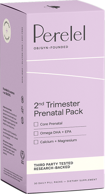
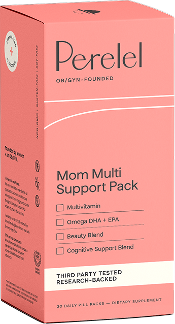
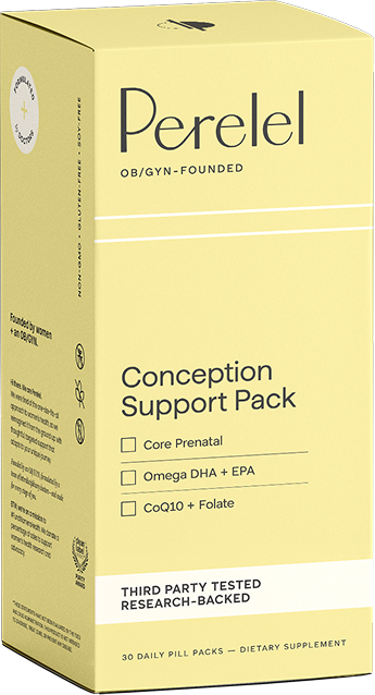
Packaging
Studio shots of every SKU — boxes, sachets, gussets, bottles, jars.
Reference
Resources
Rolodex of external tools and contacts, partner guidelines, developer handoff, and the full changelog.
Reference
Archive
Earlier explorations kept for reference: legibility testing, mono candidates.
--p-cream:    #FCFAF8;
--p-charcoal: #2A2820;
--p-melon:    #FF8080;
--p-buttercup:#E8DB84;
Resources
Developer Handoff
Token table, font-face setup, copy-paste HTML/CSS for every component.
Before and after.
Where the system is headed, element by element. The current brand reads as quiet sophistication. The evolved brand keeps that restraint and adds confident warmth with a clearer claim on the category. The team uses this table to align on direction before any single surface changes.
| Element | Current State | Evolved State |
|---|---|---|
| Overall expression | Quiet sophistication | Confident warmth |
| Category signal | Lifestyle wellness | Trailblazing authority |
| Logotype | Thin, elegant, delicate | Bolder weight, retail-ready |
| Logomark | Static, fertility-focused | Dynamic, full-timeline |
| Color palette | Muted, narrow range | Saturated, committed |
| Color application | Accent/border | Environment/ownership |
| Encoding | Single variable (color) | Dual variable (color + pattern) |
| Typography | Modest, thin | Confident, ownable |
| Photography | Literal lifestyle | Self + World, editorial |
| Background | Textured default | Clean, content-forward |
| Pattern use | Decorative texture | Categorical signal |
| Storytelling | Surface motifs | Depth and real voices |
The world.
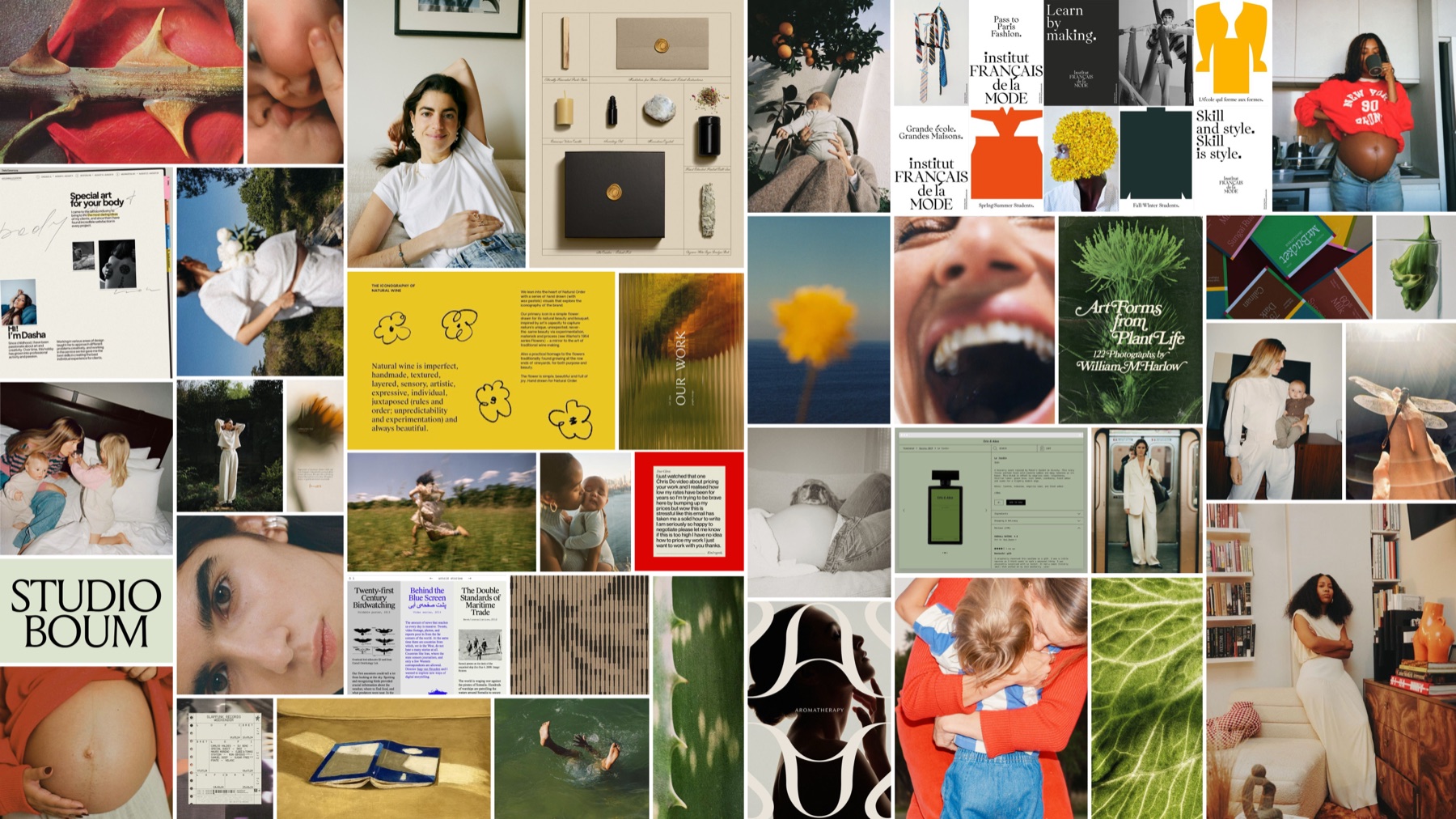
A reference collage for the evolved brand: editorial portraiture, type specimens, plant life, and the full timeline of the people Perelel serves. It sets the tonal target the rest of the system pulls toward.
For your designer.
- Start a new projectReference this design system project by URL or ID. Files (CSS tokens, fonts, components) get copied across automatically—no manual download needed.
- Source of truth
colors_and_type.cssat the project root. All tokens live here. Don't redefine colors in component files. - Type loadingFont files in
/fonts.@font-facedeclarations are insidecolors_and_type.css. - Component changesIf you change a component here, increment the version on the cover and add a changelog entry. Downstream projects can pull updated source any time.